CSS3? What's that?!
I'm sure you've heard of CSS in general. CSS3 isn't that much different, in terms of syntax; however, the power of CSS3 is much greater. As you'll see in these eleven techniques, you can have multiple backgrounds, dynamically resize those backgrounds, border radiuses, text shadows, and more!
Here's what the official (or at least, what I consider official) website of CSS3, css3.info, has to say about CSS3:
CSS3 is the new kid in the stylesheet family. It offers exciting new possibilities to create an impact with your designs, allows you to use more diverse style sheets for a variety of occasions and lots more.
What We'll Be Covering
Here are the 11 techniques that I'll be showing you how to recreate with CSS3. I'll show you how to create them using CSS2 (or JavaScript), and then with CSS3 properties. Remember - these effects will only work in modern browsers that implement these CSS3 features. Your best option is to view these with Safari 4.
- Rounded Corners
- Box Shadow
- Text Shadow
- Fancy Font
- Opacity
- RGBA
- Background Size
- Multiple Backgrounds
- Columns
- Border Image
- Animations
1. Rounded Corners
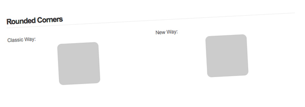
Probably my favorite on of this list, rounded corners provide a developer with so many options. You can create a rounded corner button in seconds. My favorite thing to do is set a gradient background to repeat along the x-axis and then apply rounded corners to make a very nice looking Web 2.0 button.
You can simulate rounded corners by using four extra divs or by using JavaScript. Though, a user doesn't see these smooth corners if they have JavaScript disabled, I think that's fine as long as the website still functions as it should. You can read up on this method if you would prefer to use pure CSS in making rounded corners.
Classic Way
- <script type="text/javascript" src="http://ajax.googleapis.com/ajax/libs/jquery/1.3.2/jquery.min.js"></script>
- <script type="text/javascript" src="js/jquery.corners.js"></script>
- <script type="text/javascript">
- $(function(){
- $('.box').corners('10px');
- });
- </script>
- <div class="box">
- <!--CONTENT-->
- </div>
The classical method uses jQuery along with a JavaScript plugin called Corners.
CSS3 Way
- <style type="text/css">
- .box {
- border-radius: 10px;
- -moz-border-radius: 10px;
- -webkit-border-radius: 10px;
- }
- </style>
- <div class="box">
- <!--CONTENT-->
- </div>
As you can see, all that you need to do is specify three CSS3 properties. Eventually, it will only be one; you have to use three now because different browsers use different property names.
2. Box Shadow
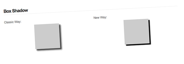
Box shadows provide you with a very powerful tool. 99% of the time when I'm desigining, I find myself using drop shadows for something. Once again, I'll be using a jQuery plugin to take care of the classic way because honestly, trying to figure it out with just CSS is confusing. Why should I waste my time fiddling with negative margins when there's already something written that does the job for me? As long as my design looks fine when people have JavaScript disabled, I'm perfectly content using a jQuery plugin.
Classic Way
- <script type="text/javascript" src="http://ajax.googleapis.com/ajax/libs/jquery/1.3.2/jquery.min.js"></script>
- <script type="text/javascript" src="js/jquery.dropShadow.js"></script>
- <script type="text/javascript">
- $(function(){
- $('.box').dropShadow({
- left: 5,
- top: 5,
- opacity: 1.0,
- color: 'black'
- });
- });
- </script>
- <div class="box">
- <!--CONTENT-->
- </div>
I'm using the dropShadow plugin. Simple and what I wanted; though I would prefer to use just CSS ;).
CSS3 Way
- <style type="text/css">
- .box {
- box-shadow: 5px 5px 2px black;
- -moz-box-shadow: 5px 5px 2px black;
- -webkit-box-shadow: 5px 5px 2px black;
- }
- </style>
- <div class="box">
- <!--CONTENT-->
- </div>
The values for the box shadow properties are: x-offset y-offset blur color. Much easier than importing two JavaScript files, and A LOT easier than messing around with background images and negative margins.
3. Text Shadow
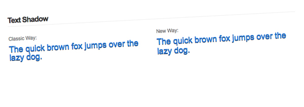
If you've ever read a tutorial about how to make the letterpress effect in Photoshop, you'll know that the drop shadow effect is used. It's really simple to create letterpressed text, just follow this tutorial at Line25 by Chris Spooner.
Classic Way
- <style type="text/css">
- .font {
- font-size: 20px;
- color: #2178d9;
- }
- .fonts {
- position: relative;
- }
- .fonts .font {
- position: absolute;
- z-index: 200;
- }
- .fonts .second {
- top: 1px;
- color: #000;
- z-index: 100;
- }
- </style>
- <div class="fonts">
- <span class="font">The quick brown fox jumps over the lazy dog.</span>
- <span class="font second">The quick brown fox jumps over the lazy dog.</span>
- </div>
Instead of using a jQuery plugin this time, I just used some simple CSS tricks to absolutely position the text behind the other copy of text. The only bad thing about not using CSS3 for this situation is that you will get two copies of the text if CSS is disabled.
CSS3 Way
- <style type="text/css">
- .font {
- font-size: 20px;
- color: #2178d9;
- }
- .font {
- text-shadow: 0 1px 0 #000;
- }
- </style>
- <span class="font">The quick brown fox jumps over the lazy dog.</span>
If you're planning on using text shadows that are blurred (the third "option" in the text-shadow property), I don't know how you would accomplish that with pure CSS, and no images.
4. Fancy Font
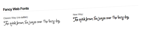
We've dreamed about it for a long time now, but you can finally display "fancy fonts" on the web without relying on JavaScript. Of course this causes some issues with allowing paid fonts to be distributed over the internet. Anyhow, I present you with @font-face.
Classic Way
- <script type="text/javascript" src="http://ajax.googleapis.com/ajax/libs/jquery/1.3.2/jquery.min.js"></script>
- <script type="text/javascript" src="js/cufon.js"></script>
- <script type="text/javascript" src="js/loyal.js"></script>
- <script type="text/javascript">
- $(function(){
- Cufon.replace('.classic .font');
- });
- </script>
- <style type="text/css">
- .font {
- font-size: 20px;
- }
- </style>
- <span class="font">The quick brown fox jumps over the lazy dog.</span>
I decided to use Cufón to replace the text. I'm not going to explain how to use it because Jeffrey has an awesome screencast already.
CSS3 Way
- <style type="text/css">
- @font-face {
- font-family: 'Loyal';
- src: url('loyal.ttf');
- }
- .font {
- font-family: Loyal;
- font-size: 20px;
- }
- </style>
- <span class="font">The quick brown fox jumps over the lazy dog.</span>
We create a font family with @font-face and then use it as a value for font-family. Michael Owens wrote an article here about a month ago which explains @font-face quite well.
5. Opacity
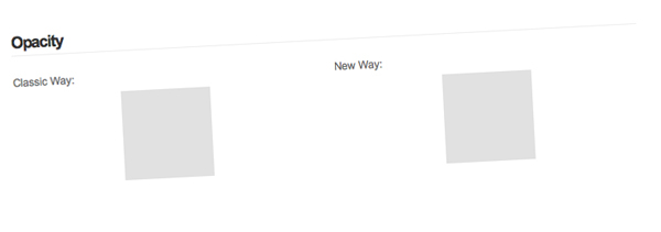
If you've visited the Envato website redesign lately, you might have noticed that there are a lot of transparent elements. Though this is achieved with transparent PNGs, you can achieve a similar effect by using the opacity property. Now, the opacity property has been around for a while, but our beloved IE has its own properties.
Classic Way
- <style type="text/css">
- .box {
- opacity: .6; // all modern browsers (this is CSS3)
- -ms-filter: "progid:DXImageTransform.Microsoft.Alpha(Opacity=50)"; // IE 8
- filter: alpha(opacity=60); // IE 5-7
- }
- </style>
- <div class="box">
- <!--CONTENT-->
- </div>
CSS3 Way
- <style type="text/css">
- .box {
- opacity: .6;
- }
- </style>
- <div class="box">
- <!--CONTENT-->
- </div>
With CSS3, we just eliminated two properties that were specific to IE, isn't that great?!
6. RGBA
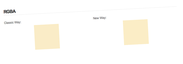
Everyone knows what RGB stands for (red, green, blue), but what does the A stand for? It stands for alpha, which refers to the transparency.
Other than rounded corners, RGBA is my next most used CSS3 property. Sometimes I just want to add a few light white/black background to navigation links when a user hover overs them. It's much easier than creating a new image for each color; however, with a little PHP it makes things a lot easier.
Classic Way
Seeing as how this isn't a PHP article, I won't be going over the PHP. Just save this file as rgba.php and when you need a certain RGBA color, make the background "color" as url(rgba.php?r=R&g=G&b=B&a=A).
- <?php
- $image = imagecreatetruecolor(1, 1);
- $r = (int)$_GET['r'];
- $g = (int)$_GET['g'];
- $b = (int)$_GET['b'];
- $a = (float)$_GET['a'];
- $white = imagecolorallocate($image, 255, 255, 255);
- $color = imagecolorallocatealpha($image, $r, $g, $b, 127*(1-$a));
- imagefill($image, 0, 0, $white);
- imagefilledrectangle($image, 0, 0, 1, 1, $color);
- header('Content-type: image/png');
- imagepng($image);
- ?>
Now just apply that to a div...
- <style type="text/css">
- .box {
- background: url(rgba.php?r=239&g=182&b=29&a=.25);
- }
- </style>
- <div class="box">
- <!--CONTENT-->
- </div>
CSS3 Way
- <style type="text/css">
- .box {
- background: rgba(239, 182, 29, .25);
- }
- </style>
- <div class="box">
- <!--CONTENT-->
- </div>
7. Background Size
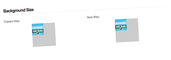
The background size property is an amazing thing to have on your tool belt when you're creating a liquid layout. An example of this could be when you have a background image for a container that is for the sidebar. The classic way of doing this would require tweaking to have the image repeat along the y-axis, but with CSS3 it's like adding another background property.
Classic Way
- <style type="text/css">
- .box {
- position: relative;
- overflow: hidden;
- }
- .box img {
- position: absolute;
- top: 0;
- left: 0;
- width: 50%;
- height: 50%;
- z-index: 100;
- }
- .box .content {
- position: absolute;
- z-index: 200;
- }
- </style>
- <div class="box">
- <div class="content">
- <!--CONTENT-->
- </div>
- <img src="http://nettuts.s3.amazonaws.com/423_screenr/200x200.jpg" alt="" />
- </div>
CSS3 Way
- <style type="text/css">
- .box {
- background: #ccc url(http://nettuts.s3.amazonaws.com/423_screenr/200x200.jpg) no-repeat;
- -webkit-background-size: 50%; /* Safari */
- -o-background-size: 50%; /* Opera */
- -khtml-background-size: 50%; /* Konqueror */
- }
- </style>
- <div class="box">
- <!--CONTENT-->
- </div>
Unfortunately, this property isn't implemented into Firefox (V3.5.2) at the time of this writing.
8. Multiple Backgrounds

Ah, multiple backgrounds. Now this give developers a very powerful tool. I can think of so many things that require multiple divs just to have more than one background. The most common place I can see this being helpful is in a header section of the website, but that's just the first thing I thought of.
Classic Way
- <style type="text/css">
- .box {
- width: 200px;
- height: 150px;
- background: url(images/bg.png) repeat-x;
- }
- .box2 {
- width: 100%;
- height: 100%;
- background: url(images/text.png) center center no-repeat;
- }
- </style>
- <div class="box">
- <div class="box2">
- <!--CONTENT-->
- </div>
- </div>
The classic method is pretty obvious, just wrap the div with another div and so on for each background you need. Produces lovely looking code, doesn't it?
CSS3 Way
- <style type="text/css">
- .box {
- width: 200px;
- height: 150px;
- background: url(images/text.png) center center no-repeat, url(images/bg.png) repeat-x;
- }
- </style>
- <div class="box">
- <!--CONTENT-->
- </div>
The syntax is really easy to pick up on this one. All you do for the multiple backgrounds is add a comma in between each one! However, once again, this is a limited property and is only in Safari.
9. Columns
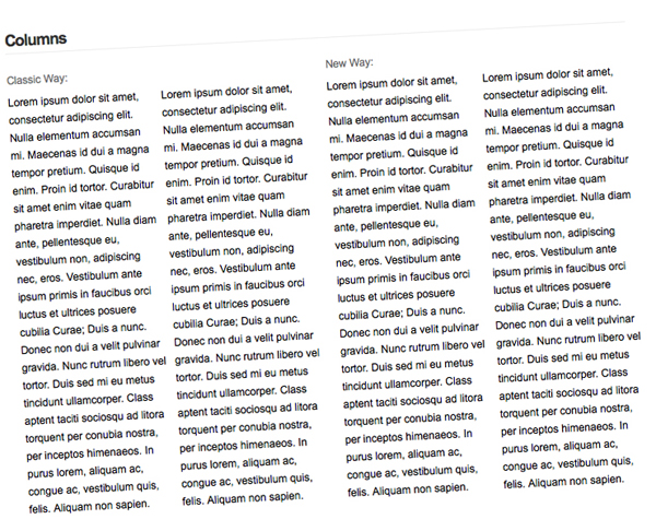
This is the most interesting CSS3 property I've come by. It's not something you see a lot in web design. Myself, I've only seen newspaper-like columns once or twice; however, I love how the effect looks when done correctly. Normally you would separate the content into divs and float those divs, but I found a jQuery plugin which dynamically renders the columns.
Classic Way
- <script type="text/javascript" src="http://ajax.googleapis.com/ajax/libs/jquery/1.3.2/jquery.min.js"></script>
- <script type="text/javascript" src="js/jquery.columnize.js"></script>
- <script type="text/javascript">
- $(function(){
- $('.columns').columnize({
- columns: 2
- });
- });
- </script>
- <style type="text/css">
- .column {
- padding-right: 10px;
- }
- .column.last {
- padding: 0;
- }
- </style>
- <div class="columns">
- <p>Lorem ipsum dolor sit amet, consectetur adipiscing elit. Nulla elementum accumsan mi. Maecenas id dui a magna tempor pretium. Quisque id enim. Proin id tortor. Curabitur sit amet enim vitae quam pharetra imperdiet. Nulla diam ante, pellentesque eu, vestibulum non, adipiscing nec, eros. Vestibulum ante ipsum primis in faucibus orci luctus et ultrices posuere cubilia Curae; Duis a nunc. Donec non dui a velit pulvinar gravida. Nunc rutrum libero vel tortor. Duis sed mi eu metus tincidunt ullamcorper. Class aptent taciti sociosqu ad litora torquent per conubia nostra, per inceptos himenaeos. In purus lorem, aliquam ac, congue ac, vestibulum quis, felis. Aliquam non sapien.</p>
- <p>Lorem ipsum dolor sit amet, consectetur adipiscing elit. Nulla elementum accumsan mi. Maecenas id dui a magna tempor pretium. Quisque id enim. Proin id tortor. Curabitur sit amet enim vitae quam pharetra imperdiet. Nulla diam ante, pellentesque eu, vestibulum non, adipiscing nec, eros. Vestibulum ante ipsum primis in faucibus orci luctus et ultrices posuere cubilia Curae; Duis a nunc. Donec non dui a velit pulvinar gravida. Nunc rutrum libero vel tortor. Duis sed mi eu metus tincidunt ullamcorper. Class aptent taciti sociosqu ad litora torquent per conubia nostra, per inceptos himenaeos. In purus lorem, aliquam ac, congue ac, vestibulum quis, felis. Aliquam non sapien.</p>
- </div>
I've added a little padding to the columns just so the text isn't smashed up against each other.
CSS3 Way
- <style type="text/css">
- .columns {
- -moz-column-count: 2;
- -webkit-column-count: 2;
- }
- </style>
- <div class="columns">
- <p>Lorem ipsum dolor sit amet, consectetur adipiscing elit. Nulla elementum accumsan mi. Maecenas id dui a magna tempor pretium. Quisque id enim. Proin id tortor. Curabitur sit amet enim vitae quam pharetra imperdiet. Nulla diam ante, pellentesque eu, vestibulum non, adipiscing nec, eros. Vestibulum ante ipsum primis in faucibus orci luctus et ultrices posuere cubilia Curae; Duis a nunc. Donec non dui a velit pulvinar gravida. Nunc rutrum libero vel tortor. Duis sed mi eu metus tincidunt ullamcorper. Class aptent taciti sociosqu ad litora torquent per conubia nostra, per inceptos himenaeos. In purus lorem, aliquam ac, congue ac, vestibulum quis, felis. Aliquam non sapien.</p>
- <p>Lorem ipsum dolor sit amet, consectetur adipiscing elit. Nulla elementum accumsan mi. Maecenas id dui a magna tempor pretium. Quisque id enim. Proin id tortor. Curabitur sit amet enim vitae quam pharetra imperdiet. Nulla diam ante, pellentesque eu, vestibulum non, adipiscing nec, eros. Vestibulum ante ipsum primis in faucibus orci luctus et ultrices posuere cubilia Curae; Duis a nunc. Donec non dui a velit pulvinar gravida. Nunc rutrum libero vel tortor. Duis sed mi eu metus tincidunt ullamcorper. Class aptent taciti sociosqu ad litora torquent per conubia nostra, per inceptos himenaeos. In purus lorem, aliquam ac, congue ac, vestibulum quis, felis. Aliquam non sapien.</p>
- </div>
There are a handful of other CSS3 column properties that you can apply, but for demonstrative purposes, I only specified the number of columns. If you'd like to learn more about these other properties, check out the multi-column page at CSS3.info.
10. Border Image
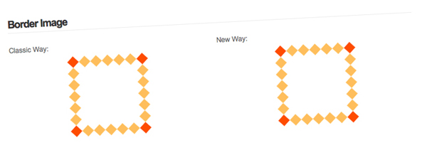
I had no clue about the border image property until I upgraded to Firefox 3.5 and went to Chris Spooner's website and saw that his post images had image borders. I personally don't have any interest in this property, but that's not going to stop me from explaining how to achieve it.
Classic Way
- <script type="text/javascript" src="http://ajax.googleapis.com/ajax/libs/jquery/1.3.2/jquery.min.js"></script>
- <script type="text/javascript" src="js/jquery.borderImage.js"></script>
- <script type="text/javascript">
- $(function(){
- $('.classic .box').borderImage('url(images/border.png) 27 27 27 27 round round');
- });
- </script>
- <style type="text/css">
- .box {
- border-width: 20px;
- }
- </style>
- <div class="box">
- <!--CONTENT-->
- </div>
Instead of spending the time creating multiple divs and repeating the background image around the div, I found a jQuery plugin that does the work for me. It's called borderImage and works just like it should.
CSS3 Way
- <style type="text/css">
- .box {
- border-width: 20px;
- -webkit-border-image: url(images/border.png) 27 round;
- -moz-border-image: url(images/border.png) 27 round;
- border-image: url(images/border.png) 27 round;
- }
- </style>
- <div class="box">
- <!--CONTENT-->
- </div>
As you can see, the border image property is a bit odd. W3 explains how it gets calculated MUCH better.
11. Animations
Alright, who doesn't love to see some element gently slide to the left or fade in when you hover over something? Animations are great to increase user interface, but make sure that you don't go over board! The only browsers that support CSS3 animations are Webkit based browsers. The only other way to display animations is to use JavaScript. I'll be using jQuery because it's my favorite JavaScript library (if you haven't guessed by now).
Classic Way
- <script type="text/javascript" src="http://ajax.googleapis.com/ajax/libs/jquery/1.3.2/jquery.min.js"></script>
- <script type="text/javascript">
- $(function(){
- $('.box').hover(function(){
- $(this).stop().animate({
- top: '20px'
- }, 300);
- }, function(){
- $(this).stop().animate({
- top: '0'
- }, 300);
- });
- });
- </script>
- <style type="text/css">
- .box {
- position: relative;
- }
- </style>
- <div class="box">
- <!--CONTENT-->
- </div>
CSS3 Way
- <style type="text/css">
- .box {
- position: relative;
- -webkit-transition: top 300ms linear;
- }
- .box:hover {
- top: 20px;
- }
- </style>
- <div class="box">
- <!--CONTENT-->
- </div>
Both of these code snippets do the same thing: slide the div 20 pixels down over the course of 300 ms. Remember, the CSS3 code only works in Webkit browsers!
Article from http://net.tutsplus.com/

1 comments:
ആഡ്വളരെ നന്ദി
ഇതുപോലുള്ളവ ഇനിയും പ്രതീക്ഷിക്കുന്നു
Post a Comment